.svg)
Course Categories & Many New Improvements
Over the past few weeks, we’ve been working on many areas of the platform. Alongside new features, our focus has been on usability, clarity, and performance.
This update brings completely redesigned course management, numerous improvements for the Community, and a wide range of design and performance optimizations across the platform.
Enhanced Course Overview for More Structure and Clarity
We’ve comprehensively redesigned the course overview, giving you far more ways to organize and manage learning content. We’ve also improved sorting, so you can find content faster.
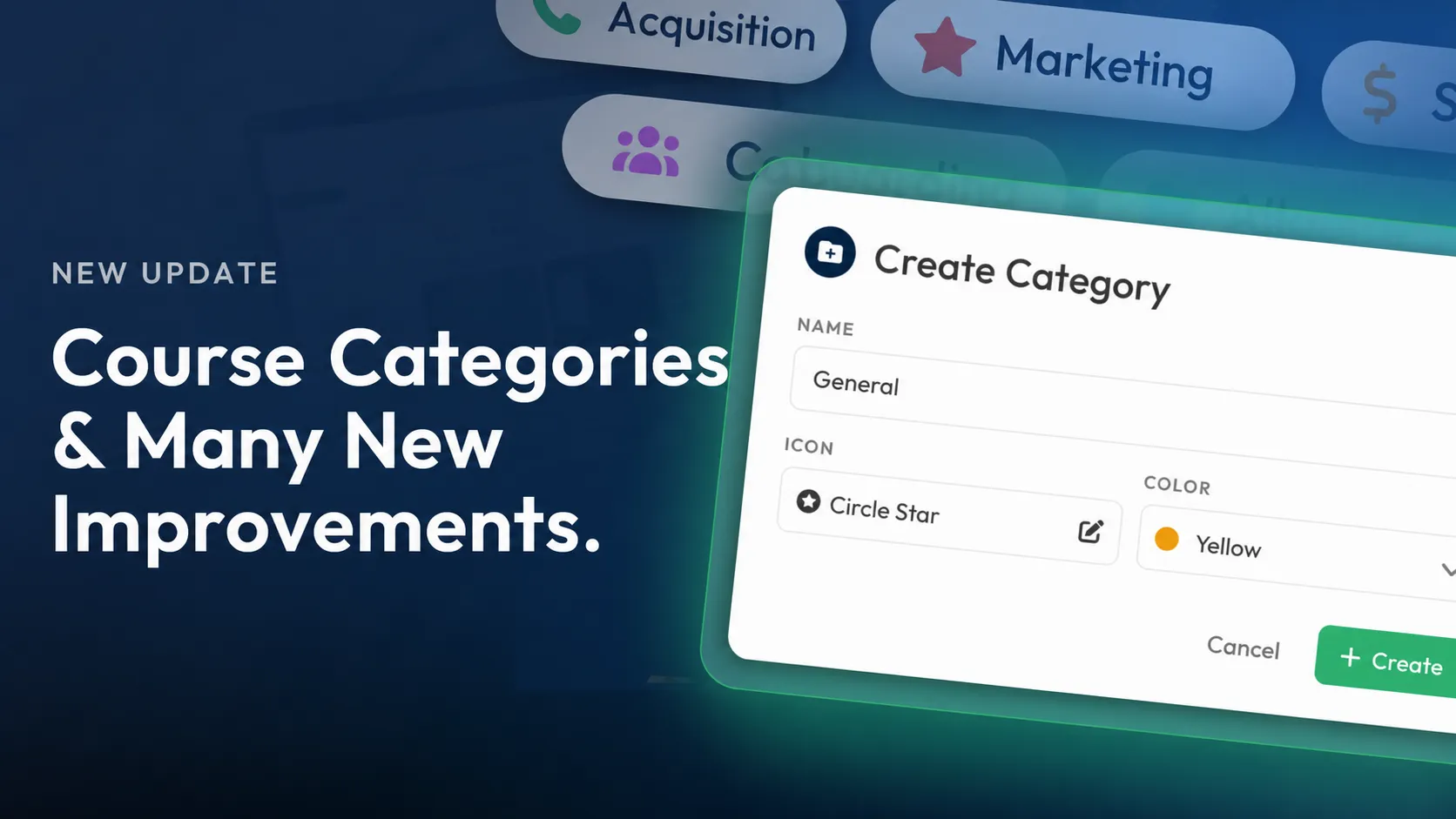
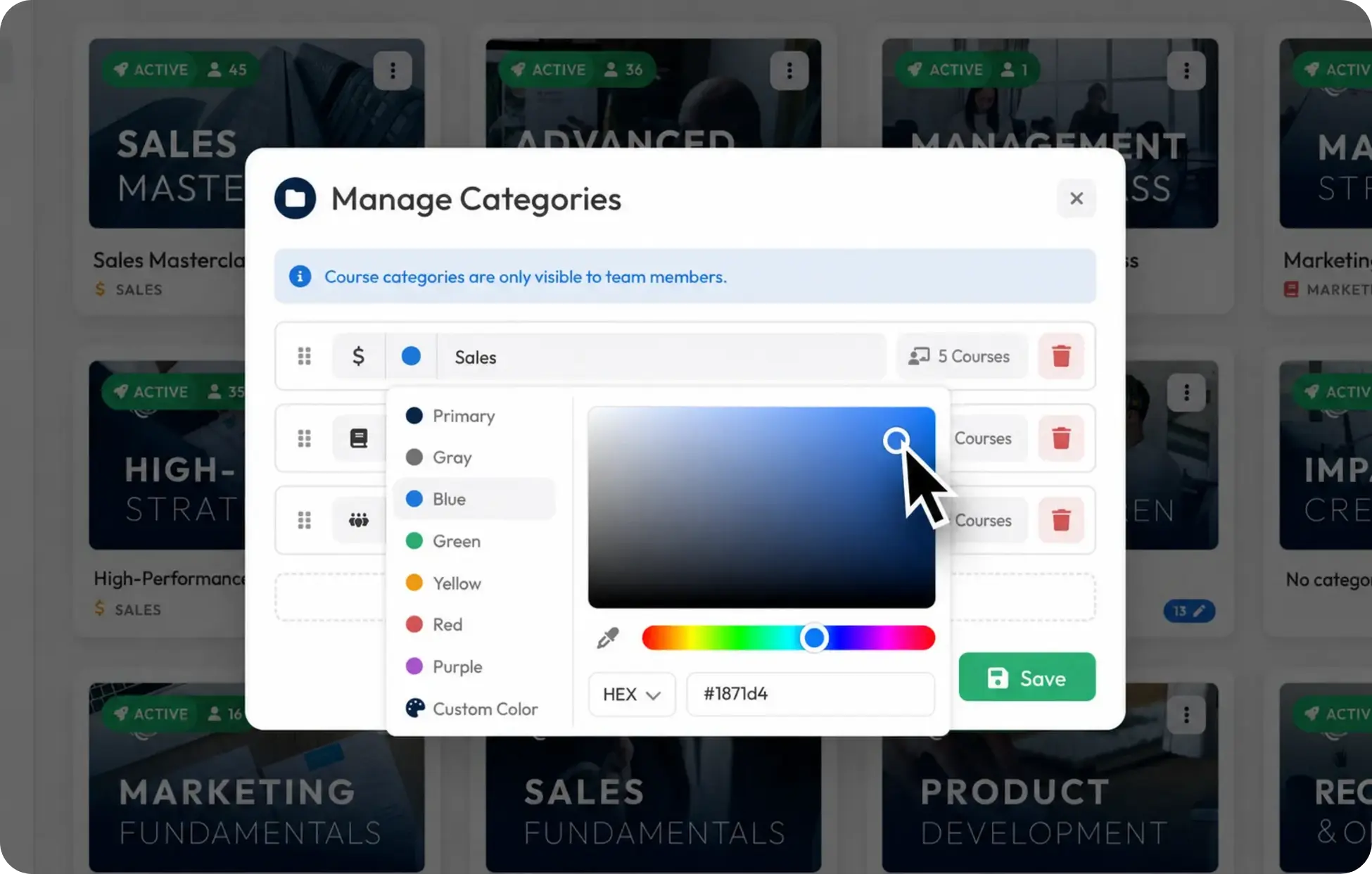
Another key focus was introducing course categories. You can now categorize Courses in a structured way, keeping even extensive libraries easy to navigate. You also get dedicated category management, where you can create, edit, delete, and individually sort categories.
The update is rounded out by modernized navigation that makes switching between different areas much smoother.
Create Community Posts via API
You can now create Community posts directly through the API. This supports not only simple posts, but also Member mentions and links to Courses.
That makes it even easier to connect external systems with the Community. For example, automated processes, integrations, or third-party applications can publish content directly to the Community while linking relevant people or learning content.

Custom Starting Point for the Mobile App
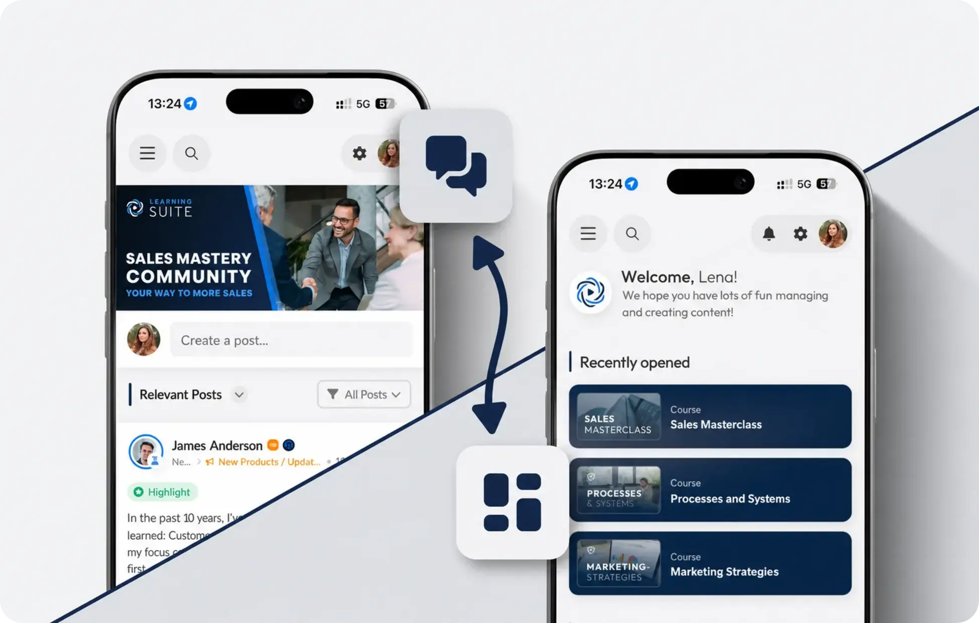
You can now define which area opens when the mobile app starts.
Administrators can choose whether Users land directly in the Dashboard or the Community. This lets you tailor the app more closely to different usage scenarios. Companies with a strong Community focus can put interaction between Members front and center, while other organizations can prioritize quick access to learning content.
Improvements to the Thumbnail Editor
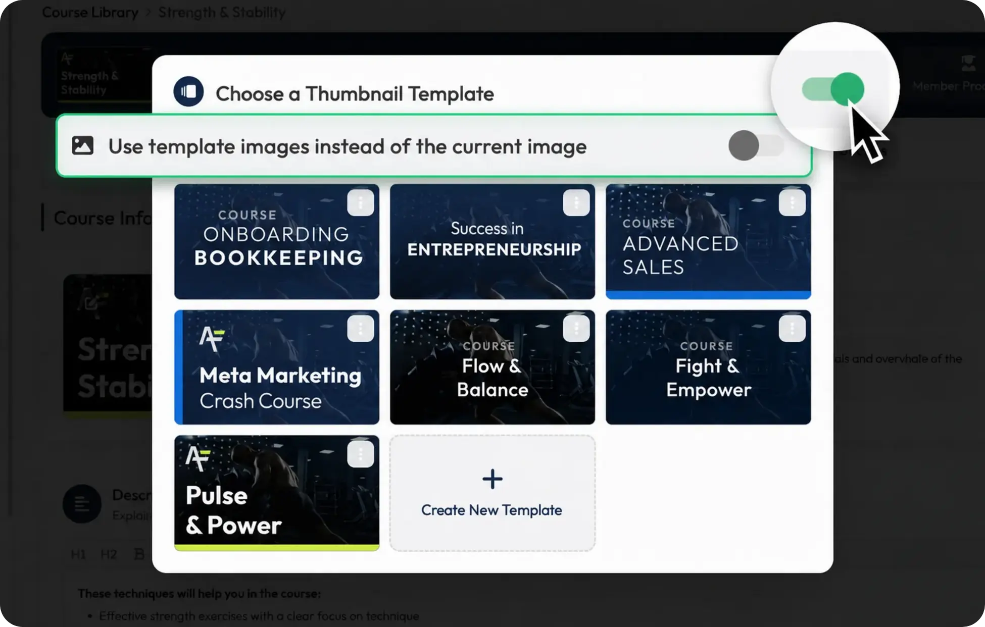
We’ve further improved the thumbnail editor, giving you more flexibility when editing existing thumbnails. You can now switch between the image currently in use and images from templates while editing. This makes it easier to customize existing thumbnails without starting from scratch.
Default templates also automatically show the relevant context, such as Course, Module, Lesson, or exam. That makes it faster to see which template is intended for which content.
We’ve also redesigned the thumbnail dialog in several areas. Selecting and editing templates is now clearer, more stable, and more reliable.
Consistent Color Picker Across the Platform
The new color picker is now used across the entire platform. This creates a more consistent user experience and lets you select colors the same way everywhere.
Alongside a more unified look, it also speeds up your workflow and makes the platform more recognizable throughout.
Redesigned Image Preview With an Improved Gallery View
We’ve completely modernized image previews, delivering a consistent experience in both the editor and the Community.
We’ve especially improved the display on mobile devices, making images more comfortable to view. The expanded gallery view now also gives you practical thumbnails for faster navigation between multiple images.

New Dialog for Connecting Modules
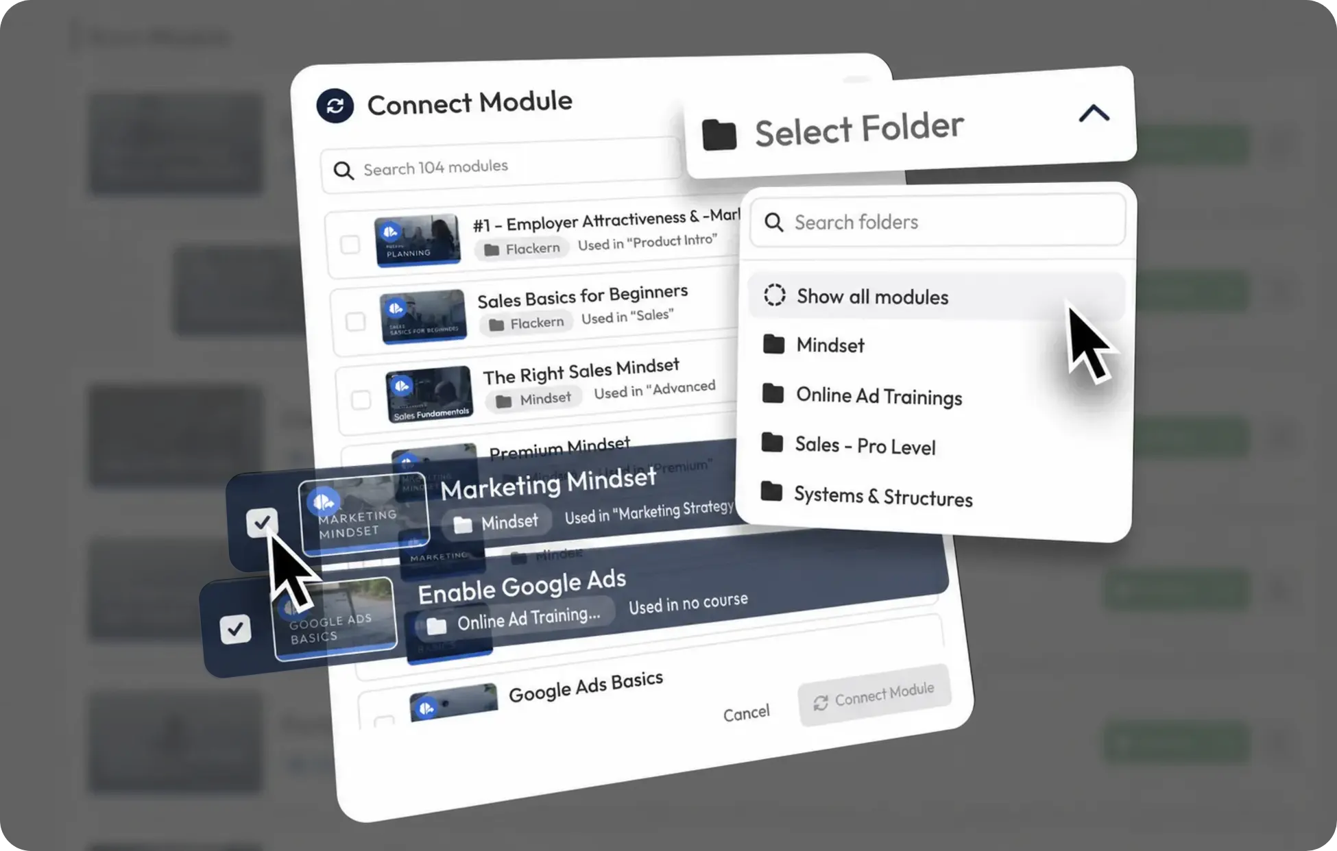
We’ve completely rebuilt the dialog for connecting Modules.
Significantly faster search, additional filtering options, and a clearer layout make it much easier to select the right Modules. Especially for larger course structures, the new interface saves noticeable time on management.
More Small Improvements
- The sidebar is now more compact and takes up less space.
- Video player volume now stays the same when switching between videos on desktop devices.
- Save buttons in forms are now enabled only when you’ve actually made changes.
- We’ve optimized image cropping, so uploaded images require significantly less storage space.
- We’ve modernized and standardized table views:
- More consistent display of labels, icons, and columns
- Improved clarity
- Optimized page navigation
- We’ve restructured the User pop-up for a clearer layout.
- We’ve added more than 30 new icons to the icon picker.
- We’ve modernized billing and payment information management for a clearer experience.
- Video transcripts are now created significantly faster.
- We’ve redesigned and significantly simplified Bundle creation. The new structure makes every step easier to follow and lets you assemble content faster. This makes managing more extensive learning offerings much smoother.
- Analytics charts are larger on mobile devices, making them easier to read.
- Breadcrumbs are now more compact and have a consistent design across the platform.
Bug Fixes
- You can now paste lists from external applications such as Google Docs into the editor and Community discussions without errors.
- Course, Module, and Lesson thumbnails are now compressed more efficiently, so images load significantly faster.
- Deleting a Course no longer interrupts ongoing exams.
- Community notifications now work correctly even when a post’s original author has already been deleted.
- The “Show more” button now works reliably for all posts.
- Submissions created via the API now use the same IDs as the platform interface.
- The Community area is once again displayed correctly on mobile devices when adding new Members.
- Unnecessary save buttons are no longer shown in certain form views.
- Bookmarks sorted by Modules no longer cause errors.
- We’ve replaced the label “Warning” in the user interface with the clearer “Note.”